Why I started looking at cherry
I bought a cherrywood trestle table that used to live at Craft in New York. It’s an incredible table: a beautifully grained American cherry top, substantial trestle supports, Brazilian imbuya trim, and even a hidden drawer for wine accessories. According to the sale listing, it was one of eight built locally in Bay Shore by Scott Woodrick, in partnership with Bentel & Bentel, the architects behind the restaurant.
Craft was one of the first restaurants I ate at in NYC, back when I was here for a summer internship in 2012. Fourteen years later, owning one of its tables feels pretty special. The restaurant’s 25-year run also helps explain the condition of the surface: the finish is failing and pretty gummy to the touch. The top is glaringly red-orange. I suspect some of that is the old finish’s ambering, but I don’t yet know how much belongs to the finish and how much to the cherry underneath.
Trying to figure out how to refinish it without ruining it pulled me into woodworking. What would it look like stripped and given a clear coat? Could I tone down the redness while keeping the grain and all the variation that make it such a beautiful table?
I came across a ton of videos about green washing. I could see that it reduced the redness, but I was unconvinced by how often the result seemed to converge toward a plain, neutral gray. And the videos mostly showed the wood immediately after washing. What would happen four to six months later, as the cherry continued to darken and mature in the light? Would the warmth come back through the wash?
That’s the motivation for this visualizer. I wanted to explore the appearance before making a decision about a table I care about. One useful observation from the model is that a paint wash can quiet the red while also narrowing the wood’s range of colors and tones. It affects the pale sapwood as well as the heartwood, and at higher concentrations the paint color takes over. Less red can also mean less interesting. The question is how much of that tradeoff I’m willing to make—and what the surface might look like as the wood underneath keeps changing.
This gives me a way to think through those possibilities. Actual sample boards will still have to answer how a particular wash and finish behave over time.
Wood color, coating, and light
Aging changes the wood’s color. A clear coating changes how that color appears, and the coating’s sheen changes its reflections. The photo-guided study treats those as separate controls: copper-orange heartwood develops alongside deeper red-brown grain, a pigment wash changes the light reaching and leaving the wood, a transparent finish deepens the color, and a highlight represents its sheen.
The development slider describes appearance stages rather than calendar years. The photographs suggest a broad range of copper and red-brown colors, but they do not establish when this particular slab would reach them.
What the newer references show
The two-panel photograph in Bob Flexner’s cherry-finishing article shows clear-finished boards without stain. The same article identifies the supplied chest photograph as 60 years old, without specifying its finish. These are appearance examples, not a timed sequence of the same board. The three-panel comparison also has different grain patterns, so its labels alone cannot calibrate an aging curve.
Sampling central wood areas in the supplied photographs, assuming sRGB and D65, gives the approximate image colors below. The orange board has strong yellow as well as red; the chest spans both brighter copper and much darker red-brown. Lighting, reflections, camera processing, and board differences are still present in these numbers. They are not measurements of bare wood.
| Photo region | L* | a* | b* |
|---|---|---|---|
| Orange panel | 64.3 | 29.9 | 61.2 |
| Darker panel | 54.5 | 35.5 | 51.4 |
| Chest, brighter door | 54.8 | 33.7 | 41.7 |
| Chest, darker door | 38.9 | 31.3 | 25.0 |
The revised palette is an artistic approximation guided by that range. Its uncoated endpoints and regional response are chosen settings, not recovered material properties. The mature heartwood with a warm coating roughly matches the brighter chest crop; it does not imply that five years produces a 60-year-old appearance.
A clear coat can change the color
“Clear” describes transparency, and clear finishes differ in their warmth. General Finishes distinguishes ambering topcoats from those that dry colorless. Flexner also describes wetting wood as a way to preview its finished appearance. No stain is needed for the grain to look deeper.
Colorless clear coat deepens the slab’s color without an amber tint. Warm clear coat adds an adjustable amber cast. Sheen and light direction change the reflection without changing the underlying palette. This SVG approximates these effects with regional color adjustments and a clipped highlight; it is not a simulation of coating chemistry or full light transport. A more physical renderer would model a reflective coating above a diffuse surface, as in PBRT’s layered-material model.
What a green wash changes
The supplied wash photos show a much paler, quieter surface than the orange-red wood. A muted paint wash can change several things together: its colored pigment absorbs some light, and its pale or neutral coverage can soften the grain and change lightness. A digital swatch alone cannot tell us how much white pigment it contains. In a Fusion makeover example, an Algonquin wash is used to quiet red mahogany. That supports a neutralizing effect, but supplies no measured cherry-aging result. Fusion describes Algonquin as a deep taupe, so it belongs here as a neutral comparison, rather than a pure green correction.
The presets use the following digital values from a published Fusion HEX and CMYK sheet. They are screen references, not measured pigment spectra or guaranteed dried-paint colors. Fusion’s own printed-color brochure also distinguishes its representations from actual painted samples. The wash photos guide the kind of effect to explore, but their lighting and treatment details do not calibrate these presets.
| Color | Digital swatch | Character |
|---|---|---|
| Eucalyptus | #b7c7ba | Pale gray-green |
| Lichen | #8e917e | Muted olive-green |
| Conservatory | #c0c8b2 | Soft yellow-green |
| Algonquin | #9f8e7e | Taupe; a neutral comparison |
The paint-wash study approximates both absorption and reflected coverage. Transparent green is a separate, idealized absorption-only comparison: it adds no pale pigment and is not a Fusion product or a recovered “pure hue” from one. This distinction lets you compare a quiet, gray-green paint wash with a filter that mainly darkens selected color channels. The layer idea follows research on compositing translucent pigment layers; this implementation uses three RGB channels and chosen optical strengths, not measured paint properties.
Dilution, coats, and wiping
The ratios mean one part paint to the displayed number of parts water, by volume. The study assumes the same wet amount per area for each coat. Under that assumption, retained paint is proportional to coats × the fraction left after wiping ÷ (1 + water parts). Two coats at 1:10 give 2/11 of that wet amount as paint; one coat at 1:5 gives 1/6. Those are close, with the first about 9% higher, rather than exactly equal.
Fusion’s wash tutorial emphasizes applying diluted paint to raw wood and wiping it back. Actual uptake and the amount left on the surface can change across coats. The dilution controls explore relative strength; they are not a calibrated recipe for achieving a photographed result.
Cherry aging beneath the same wash
The wash settings remain fixed as the underlying wood develops its patina. A light wash lets more of that changing copper and red-brown palette show through; a stronger paint layer masks more of it. The model assumes the same wood-color progression under every wash. That is a scenario to explore, not a claim that diluted paint transmits all UV: wood-finishing research identifies pigment as a source of UV protection. Pigment, film thickness, and topcoat can alter exposure, and this study has no measured transmission data.
The default comparison holds the wash and clear finish constant on both sides, showing fresh wood on the left and your selected patina on the right. Same patina · without wash isolates the wash itself. Fresh · no wash or finish compares the complete treatment with an untreated starting point.
From a slab to an ageable grain
Three original slab studies were generated with a broader silhouette in mind. Slab B was selected for its approximately 3.2:1 proportions, continuous flowing grain, two distinct knots, and legible sapwood edges. Its surface was traced at higher detail into independently editable regions, preserving the reference’s natural variation. Some fine photographic fibers remain simplified by the vector tracing.
The model distinguishes heartwood, darker grain, pale sapwood, knot cores, and the live edge. Heartwood retains the source’s local lightness, chroma ratios, and hue differences as its palette changes. Darker bands receive a deeper, redder response in the appearance study. Sapwood receives the coating’s warmth independently of patina development, and knot cores keep a dark base palette. These regional responses are illustration assumptions, not measured coefficients. Source colors lets you inspect the traced reference palette; Wood regions shows the editable masks. Material controls adjust contrast, local color variation, knot depth, and sapwood warmth.
See the generated photographic reference
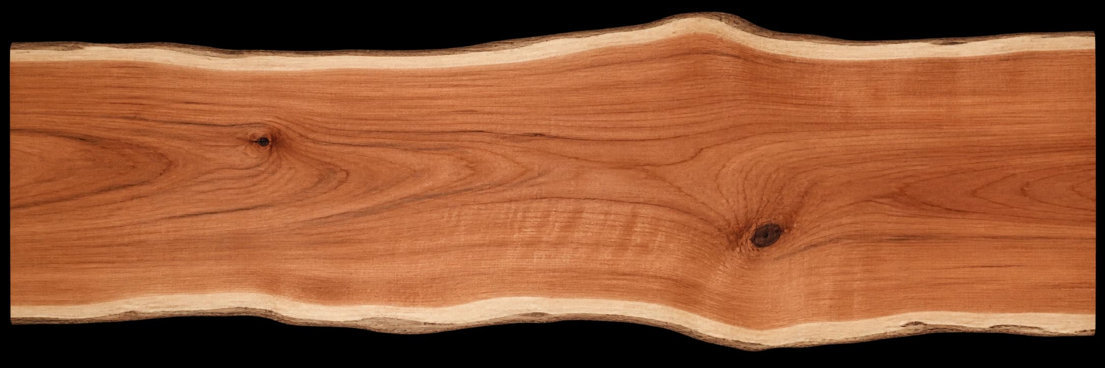
This generated image supplies the slab’s shape, regional masks, fibers, and local color variation. The photo-guided study supplies the color palette; the generated image does not measure aging.
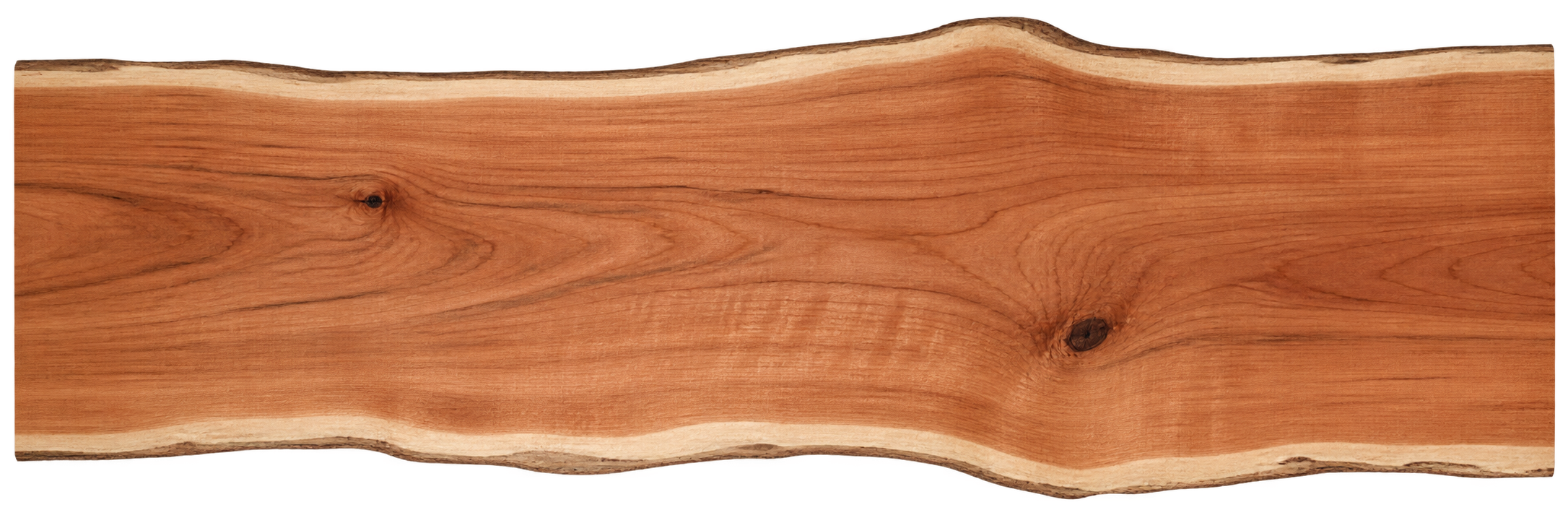
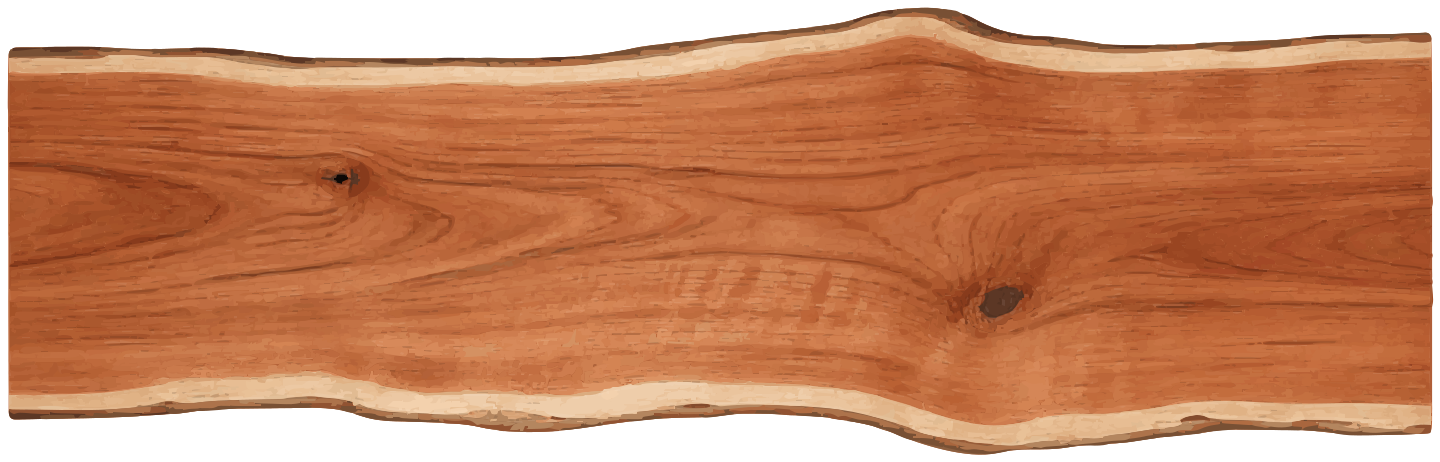
Compare the three slab studies
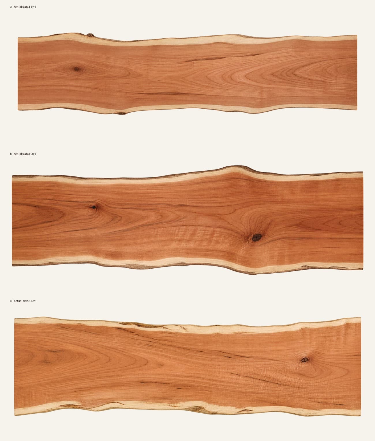
B provides the most useful mix of proportions and distinct features for the aging study. The first generation came out narrower than requested. All three originals are retained alongside the selected SVG.
Visual references included Gudde’s single-slab cherry table, Slab Studio’s overhead cherry tabletop photographs, and Collector’s Specialty Woods’ figured cherry table. These informed the material and composition; their photographs are not part of the color dataset.
What would make this a measured model?
The next step is a dataset of paired photographs: the same board before finish, immediately afterward, and at known exposure intervals. Paired washed and unwashed samples, known dilution and dry pigment load, a color reference, consistent lighting, and matte sampling regions would help separate actual wood changes from camera processing and reflections. Unpaired online photos could suggest a broad mature palette, but cannot establish a reliable calendar-time curve.
For now, this is a visual hypothesis guided by the reference photographs. It is a starting point for collecting samples and testing the trajectory.